I picked up a 75ml tube of Cryla '527 Light Red Oxide' acrylic paint and a 'Jakar, folding palette' for my watercolours. I became a watercolourist and a pastelist long before I discovered Acrylic paints and my current teach yourself course. The intention is to mix the Light Red Oxide acrylic with Prussian Blue acrylic to create a lovely grey mixture (of varying shades) to use in future acrylic paintings. I like Venetian Red (preferably) and Indian Red mixed with Prussian Blue, but I couldn't find any when I was looking through the display stand. Funnily enough, there's no colour chart for Cryla acrylic paint on display or available as a handout. But hey ho, I've got my stuff, and I'm well chuffed. Of course Daler Rowney do a Venetian Red in Cryla (product reference No.583) so that will be a future purchase. But for now it's Light Red Oxide all the way; both as a mixture with Prussian Blue, and as a stand alone colour within my seas and skies. So there's the update, and it's now time to finish this coffee and head back out into the street and maybe catch a film.
25 July 2016
Gifts
So a lovely thank you to one of my daughters who bought me a gift card for 'The Pen & Paper' shop in Cardiff for Fathers Day. I'm grateful for all of the other cards and presents I received that day as well, but it has taken until now to pop along and cash in my goody card.
23 July 2016
Stormy Sea
There's been a few days without art in my life, so it was great to get home this afternoon and take the time to tackle another A4 Acrylic image while I await some possible replies regarding the detail in the original 'Fishermen at Sea' painting that I'm working on but cannot finish due to the lack of clarity with the sourced photographs. I've put out the feelers, maybe I will get some help, but for now it's time to move on with some more art. For this demonstration painting, I'm using the Daler Rowney acrylic paper with its delightful weave surface that I mentioned in an earlier post.
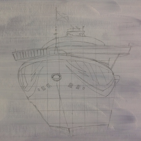
Starting with a grid and a simple sketch of my main interest point (a sailing ship), I then roughly drew in the sea and where I wanted a lead-in line in the waves; before placing a 'Cryla' Artist quality Yellow Ochre acrylic wash across the whole page using my smaller Filbert brush.
Over this base layer, I added Winsor & Newton 'Galeria' Student quality Titanium White with a brush and then blended the White and softened the edges of the paint using a natural sponge. As always keeping the sponge immersed in a pot of clean water when not in a use during the painting session.
Lefranc 'Louvre' Black acrylic paint (which sits somewhere between Student and Artist quality acrylic paint) was added to the image, along with 'Louvre' Burnt Sienna, and 'Cryla' Prussian Blue. In all instances I tried to blend the colours with the natural sponge. When I was satisfied with the effect, it was a case of using the 1" Liner brush to add more Black and Prussian Blue into the sea and then while using the same brush; overlay these two acrylic colours with Titanium white. I flicked up some of the darker colour and then the white by dry-brushing away from the mass and up and towards the right of the page. This was my 'Teach Yourself' attempt to create some further movement within the painting.
You should get the idea of the various stages as you check both of the photo panels that lead to the last image that shows the painting so far.
The next stage will be to start blocking in the ship, but alas that may not be for a few days time, as my exercise regime is ever important. With that in mind I intend to run in the Tenovus Charity 5K in Lampeter tomorrow. I mention 'run', but in reality, it's a very so plod these days, but hey ho, at least I'm giving it a go. Maybe, you should 'give it a go' with this acrylic painting malarky, and try to create your own seascape.
You could produce similar in watercolour, but if you do try; then be extremely light on the pencil marks (including the grid) and rub out everything you don't want to see in the finished piece, before you start with the base wash. Careful visible pencil marks on the ship will add to the effect, but pencil grid or straight horizon marks would look dreadful. Plus with watercolour; the paper is the White. This means that you would sponge on the base Yellow Ochre layer and leave paper showing through, rather than brushing across the whole page. Anyway, I hope that some of these comments are helpful; enjoy your art!
20 July 2016
More Turner
This image is another of my 'after' Turner attempts. The photograph shows the progress after two hours. But of course those two hours also included chatting and making a cup of coffee. So it's early days with this painting.
Photograph: Llanstephan Castle, Acrylic on Mixed Media paper
The mixed media A4 Daler Rowney paper I'm using is heavier (at 169 lb.) than the acrylic specific paper that I'm using for the 'Fishermen at Sea' image. The original in this exercise was painted by Turner between 1795-96 in pencil with watercolour. It depicts Llanstephan Castle by Moonlight. I drew out the image using a standard HB pencil, and thereafter applied layers of acrylic paint as a wash, having placed a Raw Sienna wash coat across the sheet of paper. Across the sky; I've used Ultramarine and a Red to form the grey colour and used Ultramarine neat. In all instances using a natural sponge to lift and to spread the colour while softening the edges. There's a long way to go with this painting, but an update will probably take at least two weeks, as I don't intend working on the image again until a week next Tuesday. My emphasis at the moment is on Turner's 1796 oil on canvas image. In particular, finding out the detail in the shadows so that I can better replicate both boats and their occupants.
Top tip: the acrylic specific lighter Daler Rowney paper is far superior to the Daler Rowney heavier Mixed Media stuff. You would think that the heavier paper would be better, but it's not!
19 July 2016
Turner update
Here is today's progress on my 'after' Turner painting. One hour this morning, some more research for an hour this afternoon, and then about another one and a half hours of painting. I'm very pleased with the progress, albeit I had to stretch to buying some more Daler Rowney 'System 3' acrylic paint brushes as the ones that I had were simply too broad for the finer detail. The other sticking point is simply the lack of good quality images of Turner's 'Fishermen at Sea' image online.
A lot of the detail is going to be a 'best guess'. Which is a pity, because once I get to see the original oil on canvas painting; I will see my errors and will have to consider repainting the whole blinking thing. So a better solution would be to source a nice crisp image showing all of the detail, now!
Especially a clear shot of the boat beyond the main one. I've trawled the Internet and checked out a few books. Maybe I will end up in the National Library to see if they have a large print reproduction of the original inside one of their holdings.
Another approach would be to continue as far as I can. Then stop and store the work. Visit the Tate, do some sketching and then return to complete my inferior copy. The main problem with that approach, is that it means longing it out. And I don't like longing anything out, which is probably why I give oil painting a miss.
18 July 2016
Fishermen at Sea; a further update
This is an update of my ongoing (work in progress) acrylic painting on paper that is depicting Turner's Oil on Canvas, 1796 painting, 'Fishermen at Sea'. This is somewhere around 10 or more hours in. This evening I have added layers of Cryla Prussian Blue, Lefranc Louvre Black and a mixture of both colours. I managed to buy the Prussian Blue (and some more acrylic paper) out of my share of a gift from our daughters yesterday. I've written about this work on my Social Media ArtRBA page and on this Blog. I'm really pleased with the darkening down and the real progress that I appear to have made with the image. There's a long way to go, but it seems to be taking shape.
Labels:
1796,
Acrylic,
Acrylic on Paper,
Art,
Cryla,
Fishermen at Sea,
Nocturn,
Nocturnal,
Oil on Canvas,
Turner
J.M.W. Turner, 'Fishermen at Sea' 1796, Oil on Canvas
So following on from previous posts about painting with acrylic on paper and using a combination of various brushes and a natural sponge; here is today's update of my take on Turner's 'Fishermen at Sea' 1796 Oil on Canvas painting that Turner had exhibited at the Royal Academy. I'm quite a few hours in with my attempt, there have been various layers of paint acrylic applied, and I'm a long way off the end result. So please bare that in mind when casting a critical eye over the artwork.
There seems to be a lot of errors and misunderstanding out there regarding Turner's original painting. Some commentators mention three boats when there are in fact only two. Yes, the second boat beyond the crest of the main wave can be mistaken as two boats if your'e using a poor reference photograph. But if that was the case then the mast of the closest of those 'two' boats is in the wrong place. That's because the 'mast' is the rear part of one boat, and is a similar contraption to that shown at the rear of the main boat roughly in the lower and left third of the painting.
Some people have even mistaken the rocks illustrating 'the Needles' as the sails and hulls of sailing ships and truly believe that these two fishing boats were cast off from the larger ships. Nope, these two fishing boats are just what they are, two fishing boats nestled in a sea scape.
There is even confusion about the barrel upon which the right hand of the three sea birds rests upon. This has been taken as an illustration of the stormy weather and the barrel has broken loose from one of the fishing boats, or has been swept along from elsewhere by the storm. Of course the idea of a storm swept barrel is extremely unlikely. This folks was 1796 and the scene is depicted from that time or earlier. Modern fishermen will use plastic buoys to pinpoint pots and helps to spread nets. It is plausible that the fishermen were using a sealed barrel as part of their process. If you look very carefully at the main boat, the has been cast over the side. You can see the cork floats and the shadow of the net itself.
I have even read about the boats moving through the waves. That is also unlikely given that the main boat has cast its anchor, or some form of dragging line. The line is too straight and at the wrong angle to be connected to the right hand boat. The sails are down and the fishermen are going about their business with at least one of the boats in the intended position. There is even an idea that they are rowing. Well, to me there's no evidence of oars. There is at least one if not two connecting points on the main fishing boat, but there is no oar inserted.
I hope that helps to clear up some of the things that you might have read about Turner's 'Fishermen at Sea' painting.
The next stage of the painting process is to insert some of the blue's and green's of my sky into the waves, before tackling some more detail on both boats. This of course is all in acrylic and on an A4 sheet of paper, and not oil on canvas as in the original. But meanwhile I have to slip out and have a coffee and probably go for a run.
17 July 2016
How to No.3 'Using brush and sponge with acrylic'
Today's image using acrylic on 140 lbs acrylic paper, is inspired by JMW Turner, 'Fishermen at Sea' painted in oil on canvas in 1796. A photo reproduction of the Turner painting appears in the lovely book that I recently picked up titled 'On the Trail of Turner, in North and South Wales', CADW, 3rd Ed. 2008, 56pp.
To begin the painting I prepped my usual 9mm border edge in order to tape the paper down. Then moving away from the quite vibrant Raw Sienna, I used Cryla Yellow Ochre as a base acrylic wash coat. The Yellow Ochre was deliberately layered darker in the dark areas of the sky and sea.
Cryla Titanium White was applied using a Daler Rowney 1 inch 'Script' brush, for the moon, the highlighting on clouds, and the highlight on the sea, and for the sea birds. For the broader areas; a 1/2 inch Daler Rowney 'Graduate' Flat Wash brush was used instead of my usual (and far more expensive) 'Filbert'. You can pay a fortune for these Graduate 'student' brushes, especially if you buy in the wrong place. However, the Art Shop in Pier Street Aberystwyth sell all of the Graduate range irrelevant of size or shape for an astonishingly cheap £2.50 each. Hot Tip: some of the Graduate brushes are perfect for applying make-up! Probably only 10% of the cost of branded make-up brushes. Once the white was dry, LeFranc Louvre Black was applied with the 'Flat Wash' and plenty of water. I intend to use a retarding medium (once Pay-Day comes around), but for now, I'm happy to treat the acrylics a bit like watercolour. So using a nice wet wash the black went onto the paper and a natural sponge was used to lift off the paint and to soften the edges. Natural sponge for acrylic and watercolour is far better than a synthetic sponge. But remember to move the sponge edges making contact with the paper, so that you don't end up with a repeat pattern. On this 'Teach Yourself' acrylic course, I opted for a pot of water just for the sponge. This meant that I could immerse the sponge straight after use to remove the acrylic paint. That's another hot tip, as a natural sponge can be expensive, and you don't want to clog it up or stiffen it with acrylic paint that dries like plastic.
Next I introduced some LeFranc Louvre Deep Blue into the right hand side of the sky. Along with a purple mixture of the deep blue and Winsor & Newton 'Galeria' Vermillion into the darker parts of the sky. To further deepen the sky, I added more black onto the painting. In both cases the paint was lifted and the edges softened using the natutal sponge.
16 July 2016
How to No.2 'Using acrylic on paper'
We tend to think of using acrylic on wood, canvas and canvas board. However there are papers on the market for mixed media work and specifically for acrylic paints. The one that I am using today was a gift from the lovely people in the Art Shop on Pier Street Aberystwyth. It was being thrown out as damaged stock after being on display in the window, whereupon there was a water leak. Those who know me, know that after my make everything last childhood; I hate waste. Those of you who have seen some of my previous artwork on Social Media and or my Blog; may recall a 'Reindeer snow scene' mixed media painting. That piece was accomplished on a large sheet of paper that others had amongst other things managed to coffee stain and scribble on. There was no way that I would let that particular sheet be thrown out. It was just a case of having an idea for artwork using some of the shapes and shades that appeared amongst the mess.
So here we are with an A4 pad of Daler Rowney 'System 3' acrylic paper weighing in at 140 lbs as my support for todays painting. There are other papers on the market and indeed Daler Rowney do another pad that is somehow 25% cheaper, and around 33% heavier. So I shall have to pop into the Art Shop on Pay Day and snaffle up one of those pads as well.
I marked out a 9mm pencil boarder and then applied cheap masking tape to hold the paper down while wet. I prefer to use 'Artstat' by 'Creative House' Gumstrip sealing tape (circa £4.50 per roll to hold down my watercolour paper, but opted for masking tape for two reasons; (i) I'm trying to show you how to quickly paint an effective image with acrylics and using masking tape is far quicker than gumstrip, and (ii) it's acrylic and not watercolour. So even when applying the first coat of Winsor & Newton 'Galeria' Raw Sienna as a wash, the paper shouldn't bubble up as much as with a watercolour wash. I'm also relying on the fact that in my 'teach yourself' acrylic painting course; the base wash-coat will seal the paper and future wet or wet-on-wet layers won't seep through and further distort the support.
Using the important 'Rule of Thirds', I have placed my horizon line in pencil some 6cm up from the base of the painting area. Applying the base wash-coat in one go using a Daler Rowney 'System 3' No.12 Filbert brush, I have deliberately intensified the colour below the horizon line. All of that was allowed to dry while I typed up these notes so far. It is at this point that I add 'Prussian Blue' acrylic paint to my Pay-Day shopping list, as unfortunately today I only have Daler Rowney Ultramarine, Lefranc Louvre Deep Blue and a smidging of Boldmere Cerulean Blue to work with. So here goes:
With the base wash coat dry, I've mixed up Lefranc Louvre 'Deep Blue' with Lefranc Louvre 'Black'. Leaving some of both the black and the Deep Blue untouched on the palette. Some of this 'blue-black' mixture has been applied to the paper above the horizon line. A clean wet brush was used to apply water across the paper and later on to lift off some of the blue-black where I want the light to appear. It's not watercolur and it's all 'teach yourself', so for the next stage, I added some black onto the paper in the key darkening areas. Left alone with the black block, the sky just wouldn't look right, so still using the Filbert brush, I blended the colours with brush strokes and stippling.
The left handside of the painting has distinct brush movement marks to contrast with the right handside. Some interest needed to be introduced into the sky, as this is going to be quite a simple painting. Remember, the essence of the image is quick and effective. If you look carefully I have also introduced some downward strokes of black on the left of the sky close to the horizon. This will be the rain storm over part of the city. Now it's time to change the murky water, clean the brush yet again, and then start to work on the sea.
My intention now is to limit the palette to the three chosen colours; 'Galeria' Raw Sienna, and Louvre 'Deep Blue' and 'Black'.
With everything dry, and clean water in the pot, I ran a broad stroke of water just overlapping the horizon line using my Filbert brush. In fact I ran a second stroke across the first to ensure that the overlap was wet. Still using the 'Filbert' and my blue-black mixture; I introduced shapes along the horizon line to represent Venice in the distance. By wetting the surface first and overlapping the horizon line, these shapes merge into the sea and become hazy reflections. While the paint was wet, I used the cleaned brush to brush out both the left and right handside of the cityscape, in order to get those colours (and therefore the defined shapes) to fade away. To provide some further definition black paint was brushed into parts of the central area.
The sea was constructed by using the 'Filbert' and our blue-black mixture and then black to darken down some broad areas to the left and right of the image and to further darken towards the front. It was then time to change from the Filbert brush to a Daler Rowney 'System 3' 1 inch 'Script' brush in order to introduce some detail into the sea. We are looking to apply smaller strokes to the background and larger strokes to the foreground. All I'm using is the blue-black mixture, water, and occasionally some of the Raw Sienna. I'm just forming lines across the page using varying intensities if the paint mixtures. These strokes form the sea over the original Raw Sienna 'wash coat' that was applied to the paper at the beginning of this short demonstration.
You are either going to like or dislike the final image, but I hope that there is something in this explanation that will help you with your own artistic journey. Meanwhile I have to clean up these brushes and my makeshift palette as dinner is almost ready. Oh happy days.
14 July 2016
Acrylic; Palette knife on plywood
Yesterday I mentioned the recently found and renovated Palette Knife. So today I thought that I would upload a copy of the painting that I mentioned in the post. It was painted with Cryla, Galeria, and Lefranc acrylic paints. The block white is titanium, and the yellow is Cadmium yellow and Lemon yellow (both of which are Cryla). The rigging was brushed in using Lemon yellow, mixing white, and yellow ochre. But of course the artist can use the edge of a palette knife for rigging on any ships and for the safety rails on yachts; if trying to avoid using a brush anywhere on the artwork. Although I've completed 160+ images, I'm loath to upload many of them as it's so easy for someone to make a digital copy. So that suggests that not all of my best artwork gets showcased, and sometimes only an abstract of a painting or drawing gets uploaded. I even choose to upload work in progress onto this Blog and to Social Media. As that give the viewer a feel of what is going on, without exposing the final image to copyright infringement. So in many ways, uploading this particular image is a rare treat.
It's not one of my best, but it was enjoyable messing with the acrylic paints, and seeing the original image starting to take shape before making a distinct turn into something else.
13 July 2016
New palette knife
So I'm the proud owner of a new palette knife. Well, not new exactly, as it was my fathers. So that makes it at least 32 years old. You can tell that it was well used, and the well used bit probably puts at the very least, another 10 to 20 years onto that. So as far as I'm concerned, it's a 50 year old palette knife, and those that know me, know that I like old stuff. I know that it was well used, because when I found it the other day the handle was covered with lots of oil and acrylic paint. Along with plenty of rust on the blade and leading towards the handle. It took a while to sand down, and then three coats of varnish were applied over the next few days. It's slightly smaller than the palette knife one of my daughters bought me, and it's quite a lot more flexible. I don't know if the added flexibility is due to thinning of the metal through long term use and then the oxidisation and my sanding, or if it is a design thing. Anyway, the nice touch is that Dad scratched his initials SAB into the handle, and fortunately my sanding didn't obliterate the initials. I had no idea that they were there due to the dried out paint, so that was a nice find when I applied the first coat of varnish!
8 July 2016
Palette knife
The P&O 'Azura' acrylic painting (mentioned in an earlier post) is finished, and I'm really pleased with the outcome. It has quite a dramatic feel to it. I've now got a spare 22 x 18 inch canvas board and a 40 x 30 inch canvas; to decide on which one I paint the P&O 'Aurora' thereby leaving the other support available for an image of the Celebrity 'Eclipse' cruise ship.
We are fortunate enough to have enjoyed a few cruise holidays on the Eclipse. Indeed it was on our second holiday on the Celebrity Eclipse that I started to try to paint. Eileen Brautman (the artist) was on board, and I fumbled along in watercolour. The next cruise holiday painting experience was on the P&O Aurora last year when it sailed around the Meditaerean with a sister duo taking art classes.
I seem to understand watercolours, pastels, and various types of pencils. But I have never (that is until now) grasped acrylics. Here is my current Palette Knife selection. Which is a bit bonkers as the palette knife that I have used was bought for me by one of our daughters just for applying Acrylic Gesso to wood to create structure (waves, rocks etc.,) for overpainting in watercolour when dry. Now that I've begun my self taught 'acrylic journey'; it seemed natural to progress from the eight brushed images into using a palette knife. This particular one is a 'Daler Rowney' 2020. My first attempt with the palette knife was the Venice image shown on the left. This was followed by an image of Gibraltar. The third palette knife image, is of Malta, and is work in progress. They are all roughly 22 x 15cm on plywood.
The images are representative of places that we have been or intend to visit.
1 July 2016
Wales, Wales, Wales, Wales
If they were English then they would all be invited to the Palace to be given an MBE, but because they're Welsh, they'll just have to do with a beer down the local.
Wales, European Championships, Semi-Finalists, 2016
30 June 2016
P&O Azura Cruise Ship
This image of the P&O Cruise Ship the 'Azura' is very much 'work in progress'. The 22 x 18 inch canvas board needed two coats of (The Works) acrylic gesso to cover the previous sprayed on testing work from when I was into trying to use an air brush and had divided this canvas board into four sections. The (Winsor & Newton, 'Galleria') Burnt Sienna acrylic also needed two coats. I was warned that the pigment wasn't strong, but if it's all you can afford, then it is simply all that you can afford. But as you can see; I'm down to starting the (Lefranc & Bourgeois and Galleria) acrylic colours now.
So far all of the painting has been done with a 3/4 inch 'one stroke' brush shown in the photograph, but I'll probably use a short handled No.12 'Filbert' brush and a 1 inch 'Script', if only because I bought them a few weeks ago for my Pochade Box. They will probably help with the detail on the Azura. Especially if I use the artists pigment 'Cryla' on the P&O ship. I also intend to include one or two modelling acrylic colours on the sea. You know the kind, the ones that you use to paint toy soldiers. So with that in mind, it's time to soldier on, splash out the black, ultramarine, and titanium white and do some more very enjoyable painting.
29 June 2016
22 x 18 Inches
Work in progress. I have been planning this idea in my head for some time and managed to snaffle a good photo of the ship earlier today from a friend. It is intended to be the P&O Aurora Cruise Ship in acrylic on Winsor & Newton 22 x 18 inches Canvas Board using a mixture of Winsor & Newton 'Galeria' acrylics (cheap and on offer where I shop for 4 x 60ml tubes (colours of your choice) for only £10, Daler Rowney 'Cryla' artists quality acrylic with a superior pigment and colour flow (along with a superior price of around £7 for 70ml or so), Lefranc & Bourgeois 'Louvre' which I find are a pretty good acrylic product (and were a gift when I retired), and believe it or not 'Boldermere' from the Works, which are pretty poor, but good enough when that's all you can afford. I can't recall if these were a gift or I bought them to try to complete a large piece which in all honesty wasn't one of my best goes. They will also do, as I work through using them rather than wasting them or donating them to a charity. So all in all, different manufacturers and different acrylic paints. Working in acrylic is fairly new to me, and so far, I'm finding it all good fun. My former acrylic painting style was very much like painting by numbers. Specific colours in modelling acrylic and use that colour to fill a specific area of the painting. These days I mix my acrylics and would be just as happy with one blue, one red, and one yellow, along with a white to lighten the mixed colour or to provide highlights on an image, and a black to darken it. So the two tubs of various acrylics that I have acquired over the years, could just as easily be 5 tubes. Using acrylic is less precise than watercolour painting, but some of the watercolour techniques can transpose into acrylic painting. Not that I care, as I'm having a hoot just slapping it on.
My social media art work in progress gallery is apparently sitting at www.facebook.com/ArtRBA or so I think that it is. I have acquired a real passion for art, and enjoy forming images through words and various solid artistic mediums such as the aforementioned acrylic painting, using watercolours, mixed media involving mono-printing ink and soft pastels, oil and or soft pastels as stand alone pieces, and various pencil work form a range of HB to 9B, to inktense pencils, watercolour pencils and good old coloured pencils. I don't sell my work, but I do enjoy showcasing it in its various forms. I also like showcasing my poetry and a small percentage of my artwork is now linked to specific poems that I have written.
14 June 2016
Art
Two acrylic paintings have been completed today. The first one was on canvas board bought from Poundland and took two hours at MIND this morning. That scene depicts a sailing ship with a dark moody sky. Whereas this evenings painting has no central focal point, and is just a sea and sky. It was painted with cheap acrylics on gesso prepped plywood and took 30 minutes. 300 channels and nothing on the TV, so the paints just called. I used burnt sienna as a base colour, and then burnt sienna, cadmium yellow, black, white, and ultramarine to paint the scene.
9 June 2016
Hot hot hot
With the UK weather as it is, I thought that a hot theme for this post was appropriate:
I dislike 'Hot Pressed' watercolour paper with a vengeance. Now don't get me wrong; because I don't regret buying the Daler Rowney Aquafine Smooth 'Hot Pressed' watercolour paper. Especially seeing that it was a 'buy one and get one free' promotion. Superb for a botanical watercolourist, but not much cop for the sweeping and extract landscapes of yours truly. Fair play, the paper is more like card, but the watercolour just dries too fast. So here I am on the morning of Day 4 of my current aspiring pastelist art course, and I'm quite happy to slap on some watercolour to a 16x12 inch sheet of the aforementioned 'Hot Press' in order to give myself a background for a pastel drawing later today. You can buy pastel paper and card, not pastel colours exactly (although they sell those as well) but colours suitable as backgrounds for pastel drawings. So that might include a dark brown, a dark blue, or a vibrant red. Those of you who are friends of mine on Social Media; will know that my current banner image is a Venice Scene on pastel paper in the style of Whistler, whereby the paper colour has been deliberately allowed to shine through. By applying watercolour to white paper or card, the artist can create colours for specific areas and then choose to (1) let that colour shine through, or (2) use that colour to reinforce the intensity of the top colour, or (3) use the watercolour to ensure that none of the white of the paper shines through where there's unintentional gaps in the pastel application or pastel falls away during transport or storage. So writes the man who knows nothing. Hey ho, the pigment calls, so I have to press on elsewhere. . .
27 May 2016
Ceilings all done
So the ceilings are done. The new 'T-Lock' is heavy, but not as heavy as the 16 footer. To protect the rooms off the landing, I had all of the doors closed, and phew it was baking hot up there. Off the half landing I was using the 8 foot fully extended, and thankfully only partly extended reaching out from the main landing. I also created myself a new brush extender :-)
Essential to reach a two foot length just off the top of the stairs where the stepladder and the main ladder just won't reach. I picked the size 10 art brush up for 75p and I'm looking forward to using it with oils or acrylics over the Bank Holiday
26 May 2016
Hello
Well it's been almost a month since I last posted here, so I suppose that I should say 'hello'! The Primary stage USA Presidential campaign seems to be in its endgame. You will all by now know the Cruz News. I feel sorry for his running mate, as now I suspect she can't be chosen by Trump.
But that of course is at the dizzy heights of world politics, and not the foot firmly on the ground type of life that I lead. So my mundane news, is that having glossed both sides of the new interior doors, I've now started the Hall, Stairs and Landing decorating. Okay, I have to be fair and mention that I've had a few easy going (and essential for me) days in-between; these rest days even included a trip to Cardiff. But we're back on the decorating, and so today has been a day of prepping with polyfilla, and decorators caulk. I've also bought myself two new toys from Clements in town; namely an 'Axus Decor' roller and an 8ft 'T-Lock' double click extension pole, to reach the high ceiling off the landing. I bought a 16 footer one of these two years or so ago, and used that to reach the gable end of our house when I repainted it that year. An awesome bit of kit, and the new smaller one was only £11 so all in all I've got to be happy with that.
The next job is to clean up the ladders and get them inside to reach the ridiculously high window and give it a good clean before starting to paint the ceilings. Why did the silly architect some 35 years ago; put a ridiculously high window that can't be reached without a ladder, and then use the few brain cells that he had, to fit a top opening casement window into the frame. Wanker, that folks being a technical term #AYearofDIY
28 April 2016
Cruz News
Cruz has picked a 'Running Mate', really?
That comes across as strange, and despatate. The news coverage even included someone who has apparently tweeted that this is an act of desperation. Whilst I have to agree with that appraisal, it's also worth mentioning that this is all quite sad. He's not winning in the Delegate count, he's received less votes from those that have taken the time to vote, and for me, he doesn't seem Presidential in any stretch of the imagination.
When you're losing, life can be sad. When you've lost, it probably feels worse. But then again, that's only the case when victory feels more important than the journey. It's time now for Cruzy to walk away, along with that other chap, whose name I can no longer recall.
6 April 2016
Art and Poetry
A new Tesco store is being built in our nearby town. I'm not going to get into the 'ins' and 'outs' of that development, as some people can become a tad emotional when discussing the issue. But I am grateful to the opportunity the developers afforded MIND Aberystwyth; by handing over several 8 x 4 or larger wooden panels for the Art Class to paint on. This is my 20 hour effort using acrylics. Not my favourite medium, as like oils it just takes too long. Even though I spread the hours in short bursts over many days, it was still too long. I know acrylics don't take as long as oils, but hey ho, some of us need to get on and paint another picture. Not hanging about to wait for stuff to dry, or being part of a slow application process. Give me a water based medium, or soft pastels any day.
The accompanying Poem shown on an adjacent panel was also written by yours truly.
The reason I'm posting this today, is that a friend who knew that I painted the image and wrote the poem last Summer, told me this week, that she saw a chap look at the art and then read the poem and then turn away crying.
Words can create imagery, and physical imagery can enhance words. I suspect that the readily available explanation behind the artwork; reinforced (or maybe a better word is 'enhanced') that combined process.
Although it was never my intention to upset anyone; as an aspiring artist, there must also be a small feeling of satisfaction. In that the words and painting caused a reaction.
As usual: all rights reserved Roger Bennett for the poetry and art. If you want to use both or either, then please track me down and ask for permission :-)
2 March 2016
More Presidential Stuff
Moving on from my January post about Shirley Who:
The Republicans can't blame Donald Trump for their inability to propose credible alternative candidates. I've quite forgotten who the 4th and 5th candidates are, but the apparent inexperience and wooden top nature of their candidates lying in 2nd and 3rd place, simply shines through. In fact it screams at you, more than merely shining. If I was American, I would want to make America Great Again (as opposed to 'whole') and I wouldn't vote for neither.
So if I wanted a candidate with a chance of beating the Democrats, then ole Donald would get my vote, simple as.
But it's not his fault that he is looking more and more like the Republican first choice. To me, Trump is looking like the only choice. Surely, amongst the Republican Party, there must have been a handful of potential candidates, some of whom at least had the ability to appear Presidential and the credibility and allure to attract voters. Donald Trump is starting to appear as if he can be, and does have, and the others left in the race are simply thrashing around, and from where I stand, are beginning to look really foolish.
#TrumpForPresident
#WhoisRubioCruz?
27 January 2016
Shirley Who
"In the end, anti-black, anti-female, and all forms of discrimination are equivalent to the same thing - anti-humanism."
Shirley Chisholm (1925-2005)
Shirley Chisholm survived several assassination attempts, and was the first woman to run for the office of President of the United States of America.
17 January 2016
The Force Awakens with an Imperial Rebel Scout Team in Graphite Pencil and Derwent Inktense
This A3 sized piece of Star Wars themed art was the marrying of two formats (graphite pencil and Inktense pencil) without knowing in advance if such a mixed media combination would work. Better still (or should I say, foolishly) I went and selected a large A3 sheet of Hot Pressed watercolour paper to trial the idea. I mean, common sense suggests that I should have tried it out on some scrap paper or at least on something small like A5. Hey ho, it worked and I enjoyed the artistic progress.
The graphite pencils were HB, 2B, 4B, 6B, and 8B. Whereas the Derwent Inktense (ink) pencils were a Series 2 twelve piece set with the addition of some extra nine Series 1 and 2 colours. I suspect that there were two Series; because some of the additional pencils are straight edged rather than round along the pencil shaft. Apparently the earlier issue of Derwent Inktense contained some five (out of seventy two) rogue colours that were not as colour or light-fast as the later Series. But this may of course just be rumour, and the colour range was the same with the first issue, I simply don't know. What I do know is that I love these pencils. Inktense colour and shade well onto watercolour paper, and come alive when you carefully apply water. Although I do recommend using a small rather than a broad brush to tease out the vibrant ink colour saturation.
The Star Wars Sniper or Scout Team figures have been completed previously by other artists and have appeared online for some time. The figure on the left is usually found facing left (but I have seen it facing in the other direction where someone had mirrored the image). The Star Wars scenery in which the Scout is set, is often moody and almost monotone. I also found the right hand Star Wars Sniper figure online. This cropped figure was presented as a square set up, almost like a sort of cameo. Again, with a moody and limited colour palette.
My main drawing challenge was to combine the two Star Wars Sniper figures in a realistic manner. A design that suggested their interaction within the scene was reasonably represented. This took almost a whole day of online research for the appropriate images and then the juggling of the two photographs that I eventually set my mind on. Unlike my father 'Saben'; I am not a portrait artist. So the idea of a figure or figures with masks appeals to me. But even with the face hidden, the detail was too much to draw freehand (if trying to accurately represent the original drawing). So I opted for fixing the watercolour paper down with masking tape and then marking the tape to provide a 'cm' grid for the two areas where the Star Wars Snipers would be located. These grid-line pencil marks had to be very slight, so that they could be erased or overdrawn before completing the final piece.
The next challenge was to change some of the scenery in the background, expand that scenery and then try to suggest that the Scout Team were on the high ground. I changed the rock in the original broad image hosting the Sniper with the binoculars; so that the rocks being lent on, became a tree. This leads the eye towards the second Sniper that is better hidden within the foliage.
All of the graphite range of pencils were used, and some graphite was also laid down on quite a bit of the coloured areas, before applying colour. The camouflage effect was created with a combination of two Inktense colours; where the colour from both pencils was lifted using a wet brush and then mixed. This Inktense mixture was then applied to the drawing using a brush. Of (my now) 21 Inktense pencils, the following were mainly used (in no particular order of importance):
Willow
Sun Yellow
Sherbert Lemon
Bark
Apple Green
Baked Earth
Sea Blue
Deep Indigo
and to a lesser extent; Teal green, and Tangerine. When you look at what was a new set of 12 Inktense Pencils now sitting back in their tin, you can see that for this image, both Apple Green and Baked Earth took the greatest hit.
The Star Wars Sniper Team image is called: 'Looking for Targets' and took a total of 16 hours, split into 13 drawing sessions, that were spread over 8 days. I fixed the final image with Daler Rowney Perfix Colourless Fixative. This is also my now first choice fixative for Soft Pastels when sealing between layers.
May the Force Be With You.
The graphite pencils were HB, 2B, 4B, 6B, and 8B. Whereas the Derwent Inktense (ink) pencils were a Series 2 twelve piece set with the addition of some extra nine Series 1 and 2 colours. I suspect that there were two Series; because some of the additional pencils are straight edged rather than round along the pencil shaft. Apparently the earlier issue of Derwent Inktense contained some five (out of seventy two) rogue colours that were not as colour or light-fast as the later Series. But this may of course just be rumour, and the colour range was the same with the first issue, I simply don't know. What I do know is that I love these pencils. Inktense colour and shade well onto watercolour paper, and come alive when you carefully apply water. Although I do recommend using a small rather than a broad brush to tease out the vibrant ink colour saturation.
| Star Wars Scout Sniper Team - Spotter and Rifleman |
The Star Wars Sniper or Scout Team figures have been completed previously by other artists and have appeared online for some time. The figure on the left is usually found facing left (but I have seen it facing in the other direction where someone had mirrored the image). The Star Wars scenery in which the Scout is set, is often moody and almost monotone. I also found the right hand Star Wars Sniper figure online. This cropped figure was presented as a square set up, almost like a sort of cameo. Again, with a moody and limited colour palette.
My main drawing challenge was to combine the two Star Wars Sniper figures in a realistic manner. A design that suggested their interaction within the scene was reasonably represented. This took almost a whole day of online research for the appropriate images and then the juggling of the two photographs that I eventually set my mind on. Unlike my father 'Saben'; I am not a portrait artist. So the idea of a figure or figures with masks appeals to me. But even with the face hidden, the detail was too much to draw freehand (if trying to accurately represent the original drawing). So I opted for fixing the watercolour paper down with masking tape and then marking the tape to provide a 'cm' grid for the two areas where the Star Wars Snipers would be located. These grid-line pencil marks had to be very slight, so that they could be erased or overdrawn before completing the final piece.
The next challenge was to change some of the scenery in the background, expand that scenery and then try to suggest that the Scout Team were on the high ground. I changed the rock in the original broad image hosting the Sniper with the binoculars; so that the rocks being lent on, became a tree. This leads the eye towards the second Sniper that is better hidden within the foliage.
All of the graphite range of pencils were used, and some graphite was also laid down on quite a bit of the coloured areas, before applying colour. The camouflage effect was created with a combination of two Inktense colours; where the colour from both pencils was lifted using a wet brush and then mixed. This Inktense mixture was then applied to the drawing using a brush. Of (my now) 21 Inktense pencils, the following were mainly used (in no particular order of importance):
Willow
Sun Yellow
Sherbert Lemon
Bark
Apple Green
Baked Earth
Sea Blue
Deep Indigo
and to a lesser extent; Teal green, and Tangerine. When you look at what was a new set of 12 Inktense Pencils now sitting back in their tin, you can see that for this image, both Apple Green and Baked Earth took the greatest hit.
The Star Wars Sniper Team image is called: 'Looking for Targets' and took a total of 16 hours, split into 13 drawing sessions, that were spread over 8 days. I fixed the final image with Daler Rowney Perfix Colourless Fixative. This is also my now first choice fixative for Soft Pastels when sealing between layers.
May the Force Be With You.
8 January 2016
Some more art
The Beast was dropped off for repair early this morning, so it's now a case of settling down and deciding what to start creating with the new art materials that were bought for me over Christmas and on my Birthday.
Today's Art is a tad complex and needed some lining out to help me with the combination of Graphite Pencils and Derwent Inktense Pencils. I don't know if that pencil combination will work, but we will of course find out over the next few days. The other advantage of lining out; is that watercolour paper is expensive. So I don't want to waste a sheet because of drawing errors. The intended image consists of broadly copying two separate pieces of Star Wars art that have appeared online. The main character is an Imperial Scout Sniper sat next to a tree, and who appears to be only half interested in what is going on. To try to enhance that often copied composition, I've gone for adding a second Scout Sniper who seems to be more focussed, in that this figure has the scout rifle in the firing position. I envisage this second member of the team to be in a hollow to the bottom and foreground of the tree. But alas, imagination and execution can often be quite different. So we will have to see how this one pans out, and whether or not I obtain the much needed relaxation and enjoyment.
This one is A3 size on hot press watercolour paper (smoother and dries quicker than cold press [which is also known as NOT]). The A3 size of course is less the 1cm all round to tape down the watercolour paper to mark out the lines and to try to reduce curling when I eventually wet the surface. Another good thing about taping down is that the paper should survive being but aside now and again, as I expect this piece to take a few days. I don't do pressure, so if the mood slips away, so does the art.
Labels:
Art,
Derwent Inktense Pencils,
Graphite Pencils,
Scout sniper,
Star Wars
6 January 2016
Some chronological errors
I resized some of my images and that has made a few posts skip into the wrong dates. But hey ho, so what. If you read then previously then you will know that they are a repeat of distant things.
Christmas was a dreadful affair, but thankfully the New Year was perfect (a long and leisurely Dinner out with my wife and one of our daughters), and my Birthday a few days later was pretty good as well. I talked too much at MIND yesterday and only managed to get the outline of an intended art project done. But today is another day and chronologically this should be the first one that you read of 2016
Schmincke, Sennelier, and Rowney Soft Pastels are all out. So now it's time to create:
20 December 2015
Well chuffed
I'm well chuffed with this watercolour depicting the road into our village. It was completed today, and I hope that the recipient is just as chuffed when the gift is opened on Christmas Day.
The painting is approximately 9 in by 6 in (including the 8mm White border where the masking tape is positioned). It's been painted on Cotman 'Cold Pressed' Gummed watercolour paper (a 9 x 12 sheet cut in half). I predominantly used Artists quality watercolour paints (Winsor & Newton) plus a smidging of two pigments from my Daler Rowney Artists Oil Pastels. I put on my fluorescent jacket earlier in the day and popped out if the village to take some photographs to help the composition. The sky idea came from a photograph taken by a friend of mine.
I'm really pleased with this one, as it's a huge step in the right direction on my artistic journey.
16 December 2015
Waste
Well those who know me, know that I hate waste. This is a piece of watercolour paper that someone had stuck down to a drawing board at MIND, but left alone for many many months (maybe longer) unused. This waste had been bothering me for sometime. It is quite a large piece of paper at approximately 20 x 15 inches. Lots of paint and crayon had been spilt onto it, and where other boards were taken out or put back in place, the board edges had indented the paper.
So this week at MIND Aberystwyth, I decided to do something about it. Most people would have thrown the paper away, but for me it became my art project of the session. The final image was created using soft pastels, watercolour pencils and watercolours:
1 December 2015
MIND Aberystwyth
I've been to Art at 'MIND Aberystwyth' today (I tend to think of the weekly meeting as a lifeline and become quite anxious if the arrangements change), and to Circuit Training this evening. Not that I'm doing very well with the Circuits, it's sort of walk when everyone else runs, and modifying many of the exercise stations, to suit where I actually am in the lack of fitness game. But at least I'm there, and that's the important thing.
I managed to complete a simple beach scene watercolour at MIND and then made a few art acquisitions ready for the next series of paintings: (1) the new ARCHES watercolour paper is as good as it gets, and I've been waiting to take delivery of this beauty for a while, (2) the art easel was dug out of a storage box and cleaned up (the easel belonged to my father who passed away 30+ years ago), and finally the china and loggoed up Winsor Newton brush pot, which was a delightful gift that I received from the lovely people at the Art Shop in Pier Street, Aberystwyth.
Yes the ARCHES watercolour paper is expensive, and yes, I had to raid the piggy bank, but I simply had to have a go. Not that it's opened yet, knowing me it will be put to one side for a while and then after procastination on my part, it will at some point be opened and used. Whereas I suspect that the cleaned up pot will be holding a brush or two by midday tomorrow. Don't even ask about the easel, as that's now an ornament in the corner of my den.
23 November 2015
Snow Time
This is today's piece. There was another one completed yesterday (an A3 Portrait view from North of Brodick on the Isle of Arran in Watercolour, Watercolour Pencils and Oil Pastels). This was on top of finishing the view from Arran towards Holy Isle which was painted in landscape format.
Today's piece is on 16 x 8 inch watercolour paper and the intention is again to use oil pastels and watercolour pencils to complete the piece. It is interesting to see the changes in style as I develop as an artist. As usual, click on the image if the formatting is cropped and it should open full size.
Roger Bennett
21 November 2015
Watercolour and mixed media painting: Looking out from An t-Eilean Àrd
This one was painted on Daler Rowney Aquarelle 'Cold Pressed' (also known as NOT) 8 inch x 16 inch watercolour paper. If the watercolour painting is cropped; then simply click on the image to see it full size.
It's a view from the bay at Lamlash (Scottish Gaelic: An t-Eilean Àrd) in North Ayrshire on the Isle of Arran, looking towards 'Holy Isle' on the Firth of Clyde.
It was painted using watercolour pencils, oil pastel, and watercolours.
This is one of a series of images that I have produced after our lovely, albeit short holiday on the Isle of Arran. I promised my mental ill health counsellor, that I would do some watercolour painting while on the Isle and upon my return.
For the sky: Watercolour pencils were used near to the horizon and dabbed in some places higher up, then wetted. Winsor Blue Red Shade watercolour paint, my favourite 'grey' of Venetian Red and Prussian Blue in varying intensities, and a mixture of Chinese White and Yellow Ochre. The latter being replicated in the sea along with Winsor Blue R/S.
As is usual with all of my poetry, paintings and drawings, all rights are reserved, Roger Bennett
20 November 2015
Africa watercolour painting
. . . and here is another watercolour painting for my friends, especially those in or from Africa (Patricia, Tamara, Michael, and Jeffers AKA Jeffery).
This painting of the night sky and its mass of stars, was constructed in watercolour and pen and ink and a tiny bit of watercolour pencil on an approximately A3 sheet of Daler Rowney 'Aquafine' 'Hot Pressed' smooth watercolour paper. The paper size is an Imperial measurement of 16 x 12 inches (which is a tad larger than A3).
The black ink aside, there are four prominent colours in this watercolour image, all Winsor and Newton Artist Quality paints, namely: Prussian Blue, Indigo, Winsor Orange, and Rose Dore. To a significantly lesser extent, there is some Yellow Ochre.
The pen is a Staedtler pigment liner size 0.05 which is waterproof once applied to paper. The main art brushes used for this piece were my expensive Rowney 'Diana' series Kolinsky Sable in various sizes up to size 7 and my latest minor acquisition of a Daler Rowney 'Aquafine' Liner. The latter brush offers better control than a 'Graduate' Size 1 Rigger brush.
As with all of my paintings, drawings, and poems: all rights are reserved, Roger Bennett
19 November 2015
Vive la France
I have been working on this square shaped watercolour painting 'Vive la France' for several days now. It is my Liberté, égalité, fraternité image, and my small way to pay respect to those who have suffered terribly during the series of dreadful murders in Paris. The three figures and their shadows in the foreground are painted in the blue, white and red colours of the French flag. The black car is my take on the small black car that was prominent in early news reports. The figures in the background represent those that lost their lives during these dreadful and unnecessary atrocities.
The French scene was painted square, so that the image would easily upload as my Social Media profile picture. The exact size was wholly dependent upon what size quality watercolour paper that I had in my stash at home. I opted for probably my best watercolour paper; namely 'The Langton Prestige' 100% Cotton. This 14 x 10 inch pad came in at £14.10 for 12 sheets quite a few years ago. But alas this particular watercolour pad lay lingering in an art folder, simply because I neither had the skills nor the confidence to use it. So for this painting, I removed a sheet and squared it off at 10 inches (250mm).
I used watercolour pencils to map out a similar image to one that I have painted several times before. The bonus of using watercolour pencils is that the colours fade into the painting and the artist is not left with unsightly pencil construction marks. The planning stage meant having three prominent and distinct figures and the French flag in the foreground and the tower in looming the background. But this is a 'wet on wet' watercolour process, so the flag, and the three prominent figures and the Eiffel Tower were all masked off using a masking fluid pen like applicator. This would keep these areas clear of watercolour paint until the later part of the art process.
The sky was painted first, using a combination of Winsor Newton Blue Red Shade and Winsor Lemon having first wet the paper. Greater detail was given to the car in the painting by using three different watercolour pencils, and then carefully wetting the image. The same method was used for painting the Eiffel Tower. But of course these pencil images could not be drawn until the paper was perfectly dry. The same applies to removing the masking fluid; if you try to remove it while the paper is damp, then there is a risk if tearing the paper or allowing paint seepage into the area that you are trying to keep clean. Lines were constructed lightly in pencil for the Liberté, égalité, fraternité text, and the letters were then drawn using a pencil. The pencil lines were there carefully erased, which also removes part of the shapes of some of the letters. So a black watercolour pencil was then used to reconstruct the letters. This was then finished by over painting with Winsor Newton Mars Black using a lining brush. So the process took several hours a day over three days.
One of my mental ill health issues that interfere with my art; is the hang ups I have been getting about signing my name. The small 'Bennett' has become 'Rba' with the date, and now somehow over the last two pieces it has become a broad and confident 'Bennett'. Not that this confidence is mirrored in life. Especially after the minor assault the other day, and the phone call I received from victim support yesterday. But that's another story, to hold back for another day. Today is a day of rememberance and sympathy, and a desire that all of those who were involved in any way, even a minor way, are caught and punished.
I'm pleased with the result, as it's satisfying to make a statement of solidarity.
Subscribe to:
Posts (Atom)
Custom Search