Akwaaba Welcome Croeso 你好 Ciao Welkom приветствовать Bienvenida

This Blog is about lots of things including Art, Poetry, and Pens. The Main Blogging page is the Home page and the Tabs are other almost separate stand alone pages. Select a Tab (Home, Pens, etc) and scroll down to find the text. Trust me, it is there. Return to the Home page by clicking 'Home'. Enjoy the read...

Lots of stuff including Art

Lots of stuff including Art
Newport lad from Crindau, and Ceredigion resident for 27 years: former firefighter Roger Bennett

30 June 2016

P&O Azura Cruise Ship

This image of the P&O Cruise Ship the 'Azura' is very much 'work in progress'. The 22 x 18 inch canvas board needed two coats of (The Works) acrylic gesso to cover the previous sprayed on testing work from when I was into trying to use an air brush and had divided this canvas board into four sections.  The (Winsor & Newton, 'Galleria') Burnt Sienna acrylic also needed two coats. I was warned that the pigment wasn't strong, but if it's all you can afford, then it is simply all that you can afford.  But as you can see; I'm down to starting the (Lefranc & Bourgeois and Galleria) acrylic colours now. 


So far all of the painting has been done with a 3/4 inch 'one stroke' brush shown in the photograph, but I'll probably use a short handled No.12 'Filbert' brush and a 1 inch 'Script', if only because I bought them a few weeks ago for my Pochade Box.  They will probably help with the detail on the Azura.  Especially if I use the artists pigment 'Cryla' on the P&O ship.  I also intend to include one or two modelling acrylic colours on the sea. You know the kind, the ones that you use to paint toy soldiers. So with that in mind, it's time to soldier on, splash out the black, ultramarine, and titanium white and do some more very enjoyable painting.

29 June 2016

22 x 18 Inches

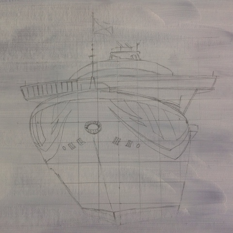
Work in progress. I have been planning this idea in my head for some time and managed to snaffle a good photo of the ship earlier today from a friend. It is intended to be the P&O Aurora Cruise Ship in acrylic on Winsor & Newton 22 x 18 inches Canvas Board using a mixture of Winsor & Newton 'Galeria' acrylics (cheap and on offer where I shop for 4 x 60ml tubes (colours of your choice) for only £10, Daler Rowney 'Cryla' artists quality acrylic with a superior pigment and colour flow (along with a superior price of around £7 for 70ml or so), Lefranc & Bourgeois 'Louvre' which I find are a pretty good acrylic product (and were a gift when I retired), and believe it or not 'Boldermere' from the Works, which are pretty poor, but good enough when that's all you can afford.  I can't recall if these were a gift or I bought them to try to complete a large piece which in all honesty wasn't one of my best goes.  They will also do, as I work through using them rather than wasting them or donating them to a charity.  So all in all, different manufacturers and different acrylic paints. Working in acrylic is fairly new to me, and so far, I'm finding it all good fun. My former acrylic painting style was very much like painting by numbers.  Specific colours in modelling acrylic and use that colour to fill a specific area of the painting.  These days I mix my acrylics and would be just as happy with one blue, one red, and one yellow, along with a white to lighten the mixed colour or to provide highlights on an image, and a black to darken it.  So the two tubs of various acrylics that I have acquired over the years, could just as easily be 5 tubes. Using acrylic is less precise than watercolour painting, but some of the watercolour techniques can transpose into acrylic painting. Not that I care, as I'm having a hoot just slapping it on.


My social media art work in progress gallery is apparently sitting at www.facebook.com/ArtRBA or so I think that it is.  I have acquired a real passion for art, and enjoy forming images through words and various solid artistic mediums such as the aforementioned acrylic painting, using watercolours, mixed media involving mono-printing ink and soft pastels, oil and or soft pastels as stand alone pieces, and various pencil work form a range of HB to 9B, to inktense pencils, watercolour pencils and good old coloured pencils. I don't sell my work, but I do enjoy showcasing it in its various forms. I also like showcasing my poetry and a small percentage of my artwork is now linked to specific poems that I have written. 

14 June 2016

Art

Two acrylic paintings have been completed today. The first one was on canvas board bought from Poundland and took two hours at MIND this morning. That scene depicts a sailing ship with a dark moody sky. Whereas this evenings painting has no central focal point, and is just a sea and sky. It was painted with cheap acrylics on gesso prepped plywood and took 30 minutes. 300 channels and nothing on the TV, so the paints just called. I used burnt sienna as a base colour, and then burnt sienna, cadmium yellow, black, white, and ultramarine to paint the scene. 


All Rights Reserved, Rba 2016

9 June 2016

Hot hot hot

With the UK weather as it is, I thought that a hot theme for this post was appropriate:

I dislike 'Hot Pressed' watercolour paper with a vengeance. Now don't get me wrong; because I don't regret buying the Daler Rowney Aquafine Smooth 'Hot Pressed' watercolour paper. Especially seeing that it was a 'buy one and get one free' promotion. Superb for a botanical watercolourist, but not much cop for the sweeping and extract landscapes of yours truly. Fair play, the paper is more like card, but the watercolour just dries too fast. So here I am on the morning of Day 4 of my current aspiring pastelist art course, and I'm quite happy to slap on some watercolour to a 16x12 inch sheet of the aforementioned 'Hot Press' in order to give myself a background for a pastel drawing later today. You can buy pastel paper and card, not pastel colours exactly (although they sell those as well) but colours suitable as backgrounds for pastel drawings. So that might include a dark brown, a dark blue, or a vibrant red. Those of you who are friends of mine on Social Media; will know that my current banner image is a Venice Scene on pastel paper in the style of Whistler, whereby the paper colour has been deliberately allowed to shine through.  By applying watercolour to white paper or card, the artist can create colours for specific areas and then choose to (1) let that colour shine through, or (2) use that colour to reinforce the intensity of the top colour, or (3) use the watercolour to ensure that none of the white of the paper shines through where there's unintentional gaps in the pastel application or pastel falls away during transport or storage. So writes the man who knows nothing. Hey ho, the pigment calls, so I have to press on elsewhere. . . 

Custom Search