Akwaaba Welcome Croeso 你好 Ciao Welkom приветствовать Bienvenida

This Blog is about lots of things including Art, Poetry, and Pens. The Main Blogging page is the Home page and the Tabs are other almost separate stand alone pages. Select a Tab (Home, Pens, etc) and scroll down to find the text. Trust me, it is there. Return to the Home page by clicking 'Home'. Enjoy the read...

Lots of stuff including Art

Lots of stuff including Art
Newport lad from Crindau, and Ceredigion resident for 27 years: former firefighter Roger Bennett

30 September 2016

Another Version

Accidentally making the move to trying out Winsor & Newton Watercolour Markers has been a good, albeit frustrating thing.  The good points are that I like the product, I like the ease of handling, and I like the three colours that I was gifted.  The bad point is that I need a yellow, and you can't buy these watercolour markers (individually or in a set) in Aberystwyth.  So if you know anyone in Winsor & Newton product development or marketing, tell them to find me on social media and get in touch.  Because at the moment, I'm confined to a red, a green, and a blue marker.  Albeit, they are a pretty good red, green and blue.


Photograph: Venice
Using watercolour markers on circa 7 x 5 cheap watercolour paper 
ArtRba you can also find me on Social Media *

I've completed a few similar images, using various size and type of watercolour paper, as I begin to understand how the watercolour marker product works to best effect.  

I'm noticing that the nibs spread (but that was anticipated, so no problem there) and that the application of water needs to be thought through, as the paint merges (again, anticipated, but controlling needs to be learnt).  

The big pluses are (1) the vibrancy and punch of colour, and (2) the ease of use (which suggests that the Winsor & Newton Watercolour Marker is ideal for in the field sketching.


* ArtRba my posts on Blogger are always more detailed.

29 September 2016

Winsor & Newton Watercolour Markers

I've had a stressful few days, so this is the sum total of my artistic dabblings since Tuesday morning.  On the minus side, I feel a tad let down by someone of whom I thought the world of.  Whereas on the plus side, I was delighted by someone of whom I expected nothing.  It's a funny old World.

So I tried to park the stress by using three Winsor & Newton Watercolour Markers for the very first time this evening.  The watercolour markers that were used are Winsor & Newton 'Sap Green', 'Phthalo Blue (Red Shade)', and 'Alizarin Crimson Hue'.  Like most professional art products, they're expensive at £3.99 a pop. Although it's worth remembering that because they're watercolours, I don't own three colours, but four.  This is because the white of the paper is the fourth colour. 


Photograph: the markers and the initial drawing
As is often the case with Blogger: click on the photo to see the full image
ArtRba

It's a little Venetian scene, mainly because Venice is my 'theme of the moment', and I guessed that these watercolour products that have sat unused in my bureau drawer for many months; would lend themselves to this watercolour style.  Of course, after obtaining the markers, I went and completed a 'Colour Theory' course with the WEA-YMCA.  So I now know that instead of the green one, I actually needed a yellow. 

Hey ho, my hand will have to dip into my ever deepening pockets, and instead of a bunny, pull out some more dosh. This time, for a fourth Winsor & Newton Watercolour Marker


Photograph: the result after water is applied and spread to suit
Don't forget to click on the image!
ArtRba

The water spreading also includes 'on the paper' mixing.  This means that the watercolours get transferred around, blended, lightened, and darkened etc.,  Maybe this on the paper mixing is something that you could try.  Go on, you know that you want to!

25 September 2016

Art In The City

Or is that ArtRba in the City?


I had a lovely weekend in the City, meeting up with family.  I even managed to get in a painting, which was a huge bonus. 

Here's yesterday's artwork (completed in Duke Street Caffè Nero) after breakfast in the city and then some shopping. It's on Bockingford cold pressed acid free 300 gsm (10 x 7 inch) traditional watercolour paper. Using professional quality Winsor & Newton; Winsor Blue Green Shade (one of my favourite colours), Lemon Yellow, Alizarin Crimson, Ivory Black, and Yellow Ochre. Albeit the yellow ochre was more about the horizon.

In general terms (unless you're trying to create deliberate angles and cropped sections of a scene, or close in on the action on the high seas) water is self levelling and the horizon should be flat.  Which is fine if you have a ruler or have marked out the backing card of another watercolour block or pad, but is a tad awkward if you've got nothing to use, including no pencil.  At which point I used the end cap (without the water of course) of my watercolour Field Box, and dabbed Yellow Ochre here and there as I moved the cap along inline with the edge of the paper.  I then joined up the dots when I started on the sea part of the painting.  This meant some yellow ochre showing through on the horizon, which I overcame by using yellow ochre in a few places elsewhere on the sea.


Photograph: Cormorant in flight across the bay
All rights reserved RBA Bennett, i.e. ArtRba 

I bough the Bockingford pad from a lovely Art Shop called Pen & Paper in if I recall correctly, the Royal Arcade. I always buy something in there whenever we visit, as it's very important to support specialist high street shops who have to compete against Internet prices.  The thing is; once they're gone, they're gone, and I defy you to obtain the level of knowledge these Art Shop owners have elsewhere. Yes you may occasionally save a few bob, but you don't always guarantee original or even new stuff, and the subtle difference pays for itself. 'How?' I hear you ask.  Well, it's simples, all that knowledge that you squeeze out each visit, is free of charge, which is gobsmackingly cheap compared to the cheapest adult Art Courses at more often than not £100 a pop. 

22 September 2016

South Beach, Aberystwyth

And here is today's output with my new Watercolour Field Box!

It's on a Langton Prestige 'Fine Grain' COLD watercolour paper Block.  Using my new travelling Filbert brush that I mentioned in a previous post, and the small travelling brush that comes with the Winsor & Newton Field Box.


Photograph: South Beach, Aberystwyth
(Painted outdoors at the location) 
ArtRba

I used Winsor Blue Green Shade for the sky and the sea, and mixed that with Winsor Yellow for the hills to the left and distance.  Yellow Ochre was used for the harbour wall.  Aliz Crimson mixed with Winsor Blue G/S for the foreground pebbles, with a deeper mix for the ones closer to the shoreline.  The same mix was used as shadow on the harbour wall, the small self contained lighthouse at the end of the wall, the sailing boat and the breaking waves.  Burnt Sienna provided some of the driftwood detail on the pebbles, and some contrast in pebble colour.

This one took about two hours to paint.  A lovely two hours sat in the chair that Mrs B recently bought me and wearing my floppy sun hat that one of my daughters bought me for using when out and about painting.

Interestingly, I kept my sunglasses on and didn't wear my reading glasses for painting.

21 September 2016

Winsor & Newton Artist Quality Field Box

I've just taken delivery of an Artist Quality watercolour 'Field Box' from the Art Shop at No.5 Pier Street, Aberystwyth.  It's a lovely compact little thing, the Field Box that is, not the Art Shop

The Art Shop in Aberystwyth is stuffed with lots of lovely things, run by two lovely people, and Brian is uber knowledgeable. Indeed, it's quite scary what he knows.  And that knowledge and friendliness sort of gives the reason why we should shop local and not online.  Oh, and the price was keen as well.

This particular Winsor & Newton watercolour Field Box opens out to reveal 12 Artist Quality half pans, a natural sponge, two integral fold out mixing palettes, and a small pop out water bottle. The Field Box also comes with a small brush that sits in its housing, but when you take it out its in two parts, that push together to make a longer handled brush.  While the end cap for the Field Box doubles up as a water reservoir that clips back onto the main body.  So the watercolourist is self contained, with a compact and reasonably light portable studio. Oh, did I mention that it was nifty? Because this Field Box is nifty, and this watercolorist is well pleased! 


Photograph: Winsor & Newton Watercolour Field Box
(I opened some of the half pans in excitement before pausing to take the photograph)

I made a few alterations and additions to the set up: I've dumped the Chinese White that came with the Field Box and replaced it with Quinacridone Gold. This colour is a particular favourite of mine when painting Venetian scenes.  I've written out my name, and contact details and placed that under the half pans (just in case the Field Box goes missing or is stolen), and I've put together the names and colours on a small piece of card to remind myself what I'm carrying in this kit, compared to my main studio stuff.  With both the contact details and the watercolour palette colours: I cello-taped one side beyond the card, turned it over and done the same underneath, and then trimmed the surplus clear tape to fit. That should help with water spills and seepage when the Field Box is in use.

Although please note that I took the photograph before doing the taping. It's all so exciting, I just got carried away.  Indeed, I even left out the ArtRba bit and just used Roger Bennett!

Drawing and Painting

'Drawing is a way of seeing, and (...) painting is an extension of drawing' Weaver, P. 'The Artist', July 2015, p.43

19 September 2016

How to No.8 Using colouring pencils

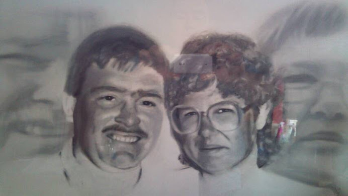
Well I don't think that's too shabby, a first attempt with my new Karisma Colouring Pencils.  I sort of hope that you agree, because I'm delighted with the outcome and this one has already found itself inside an envelope, all wrapped up, and posted out as a gift to someone whom I met on the P&O MV Aurora.  It's just pigment with the Karismacolor product, you don't add water or a wash.  Unless of course you're expanding your artistry into 'Mixed Media'.  So this is another example for the ArtRba file. The RBA bit stands for my initials and the rest is self explanatory.


Photograph: Venice, Karisma pencils on 165 gsm smooth paper circa 7x5 inches
(ArtRba all rights reserved [as is always the case with my Art and Poetry] 2016)


My learning outcomes as I move further into my 'teach yourself' coloured pencils home and coffee shop course, are:

(1) the intensity of the coloured pencil pigment laid, depends on both the pressure applied to the art pencil and the number of layers that an artist uses over their first and subsequent layers.

(2) the surface pattern that can be created when laying the pencil pigment is dependent upon such things as (but is not restricted to) [i] the type paper used, and [ii] the surface on which that paper rests, and [iii] any indentations into the surface of the paper that are deliberately made by the artist

(3) mark-making adds to the outcome of the finished image.  Such mark-making could include (but yet again is not restricted to) [i] short or long lines with intense pressure, [ii] stabbing into the paper, or [iii] moving the pencil in the direction of the shape [rather than a tendency to go horizontally across a page with watercolours], or [iv] indentations or raised edges forced into the paper, [v] scrubbing in colour (on good quality paper that can withstand scrubbing), [vi] hatching, [vii] shading.

(4) depending upon the quality of the paper used, highlights could be achieved by using an eraser or even sandpaper.  Alternatively the artist could use a white pencil of the same brand.  Unlike with watercolour where it's essential to preserve some of the white of the paper.  The lightening process could even include the use of chalk, or white soft pastel, or white oil pastel (notwithstanding that with the chalk or soft pastel a fixative would be required).

(5) pigment could be lifted from the colouring pencil [through sharpening or using a course nail file] and then allowed to fall onto parts of the drawing.

(6) layering a pencil colour on top of a previous layer can change both the intensity of the colour of the previous layer, and the final colour itself.

(7) after sharpening, the colouring pencil tips can be maintained sharp by using a small card and glass paper disposable nail file before the next sharpening.

(8) blending of the different pencil colour pigments can be achieved by using one colour on top of another, or with the use of a paper blending stick.

(9) controlled indentations can be made into the paper by using [i] the tip of a blunt dart that has been made blunt and cleaned using a metal file, or [ii] the small end of the nail art tools that are quite often sold by Poundland at, you have it, in the U.K. £1 for a set of four.  But don't hold me to that price!

There you have it; some useful advice courtesy of ArtRba

18 September 2016

Karisma in England and the USA by Berol Karismacolor

I bought these beauties second hand a few months ago.  A full 36 set of Karisma 'soft lead pencils of the finest quality'.  Made by Berol in both England and the USA.  They came in at £125 but I have seen them sold for much more.  These highly blendable colours are highly sort after.  The box contains:

Indigo Blue 901
True Blue 903
Light Blue 904
Peacock Green 907
Grass Green 909
Olive Green 911
Apple Green 912
Green Bice 913
Cream 914
Lemon Yellow 915
Canary Yellow 916
Yellow Orange 917
Orange 918
Light Green 920
Vermillion 921
Scarlet Red 922
Scarlet Lake 923
Carmine Red 926
Blush 928
Pink 929
Violet 932
Blue Violet 933
Black 935
Tuscan Red 937
White 938
Peach 939
Yellow Ochre 942
Burnt Ochre 943
Burnt Umber 947
Sepia 948
Silver 949
Light Violet 956
Light Aqua 992
Bright purple 995
Grape 996
Yellowed Orange 1002 


To which I can add in loose format: 

Chartreuse 989
Spanish Orange 1003
Violet 1007
Dahlia Purple 1009
Pink Rose 1018 
Peacock Blue 1027
Warm Grey 20% 1051
Warm Grey 70% 1056
Cool Grey 20% 1060
Cool Grey 30% 1061
Cool Grey 50% 1063
Charcoal Medium

Which gives me a working set of 47 Karismacolor pencils, which should be enough for anyone.  The Karisma box set is lovely, but the pencil design was probably more about selling individual units.  Hence the slanted end.  Each Karisma pencil would be stored upright in the display stand and the approaching customer would see all of the lovely colours without having to read the labelling or pick up the product.  This kind of display meant that the tips weren't damaged during handling, which in turn could put off the next customer.  I suspect that the compact upright display also lent itself to less wastage from theft as everything was highly visible and in your face.  Another plus side was after sharpening a Karisma pencil past its label, the artist could return to the shop with the end bit and match it to a specific colour within the display.   

So giving its display and other advantages, along with the awesome reputation that the Karisma pencil pigment and blending properties enjoyed; we just got to ask ourselves why on earth did they cease manufacturing the Karisma pencil in its original format.  It seems so strange, especially when you look online and see that it costs circa £275 for a box of 76 Caran d'ache Luminance pencils. 

There is of course a downside to my now lovely collection of Karisma pencils.  Although they are really nice; I have no experience of using coloured pencils, other than when I was a child.  Watercolour pencils yes, Inktense pencils yes, graphite pencils yes, pencil pencils no.  So this could make for some interesting art as I flounder along on yet another self taught course.   


16 September 2016

Venetian Watercolour

This is today's output so far. The art was started while we were on holiday after I gave away a painting that Pauli liked. Drawing the Venetian scene using Yellow Ochre and a Daler Rowney Aquafine 10/0 'Liner' brush took about one and a quarter hours. It is painted on a 14 x 10 inch 'Lana' cold press 300 gsm fine grain watercolour block.  A block has many sheets of watercolour paper gunned down on all four edges so that you paint on the upper sheet and when dry detach that sheet from the block.  It means hassle free watercolour painting, without the need to tape the paper down onto a larger board. 

On this occasion, I'm using Winsor & Newton Artist Quality watercolours:

Winsor Blue Green Shade
Winsor Lemon
Raw Sienna
Yellow Ochre


If you can't see the whole photograph, click on the image and it should open full in your browser.  Blogger often crops photographs unless you resize them (small) in the full Windows online version of the page.  The photograph shows the three distinct stages of this artwork to get where I am now.

I've imaged the boat using a WH Smith watercolour pencil of no distinct labelled colour (when producing cheap pencils, they have to cut down on production costs, so they don't label them).  

The plan when dry is to detail the sea with the Winsor Blue G/S and the boat in green (mixed with the Winsor Blue G/S and the Winsor Lemon) and Blue Black.  The watercolour pencil outline of the boat, should in the main, wash out.  That's the joy of using watercolour pencils to map out the whole or part of a watercolour image.  

The shadowing on the buildings etc., will be my usual mixture of Prussian Blue and Venetian Red. Well, with a scene of Venice, Venetian Red just sort of has to be used, doesn't it? 

15 September 2016

More inktense

"Come in number AB 104, your time is up."

Well I don't know who owns 'AB 104' but that was enjoyable three hours working the Inktense Pencils outdoors down near the Marina in Aberystwyth and then finishing off with water and a brush inside one of my favourite coffee shops.  This particular piece of art is approximately 7 x 5 inches on 'Hot' Langford watercolour paper


It was also the first time that I tried out my big floppy hat bought for me by one of my daughters to keep the sun off me when out and about painting or drawing.  The hat was a success too, so all in all, it's been a great day!

14 September 2016

New chair, lovely weather

What a lovely evening it was, settling down in the glorious sunshine and drawing outside in the church car park opposite Aberystwyth Castle

I thoroughly enjoyed the art, and the warm air and sunshine.  It was also my first run out using an outdoor collapsible chair that Pauli bought me just before our holiday.  This portable delight was bought purely to encourage me to get out and about with the art.  Better still, the cup holder in the chair, was the perfect place to stand my Inktense Pencils, whereas my Inktense Pencil zipped wallet (a brush wallet snaffled up for the pencil carrying purpose) formed the perfect table to rest the watercolour paper on while completing the art.  I spotted this particular view a week or so ago. Photographers often photograph the Castle Keep full on, whereas I found this side view (with obligatory seagull in situ) to be the perfect angle for a coloured ink and wash drawing.  

When I wrapped up at the Castle, I found a spot on the benches at the top of town and started an image of the Clocktower and Starbucks building.  I tried this scene as a Mono-Print with Black Pigment Liner and Artist quality Soft Pastels about a year ago, and it just didn't work. So maybe this image is about removing the demons that appeared upon my previous failed attempt. In fact that attempt was so bad, that just now I visited my Mono-Printing Album on my Tablet to check the date, and found that I had never taken a photograph of that particular mixed media work.  Now that's not like me, and it's not the type of behaviour that I would encourage you to adopt. Nope, it's best to embrace all of our artistic attempts, whatever their merit, and try to learn and develop from them all.

12 September 2016

Carden Bach

ArtRba 

Whoop, whooop, whooooooop; my new 'Business Cards' have arrived.  Well, not so much 'Business', but more 'Point of Contact' cards.  Each ArtRba card represents an opportunity of staying in touch with all of those lovely people that we bump into as we meander our way through life.  The artwork used on the ArtRba card; is a little something of Venice that I painted in watercolour while enjoying this years holiday on the P&O Cruise Ship the MV Aurora.  As is so often the case, this watercolour painting of Venice was given away.  On this occasion the fortunate recipients were Steve and Jan from Bridgend in South Wales.  A lovely couple who we chatted to on a table next to us on the second night of our P&O Cruise Holiday to the Med.  


I couldn't afford any writing on the back of the ArtRba card, but thought that I could write down the web address whenever someone asked me about the ArtRba page on Social Media.  

It was a daunting experience designing the card on VistaPrint.  The task took far too long, and alas I'm not too task orientated these days.  But maybe the scariest bit was when I was going through the checkout process and the pound signs seemed to be racking up.  Although in all fairness, I'm well chuffed with the quality of the ArtRba card, the clarity of the writing, and the speed of delivery.

I'm also chuffed that the Vista guys and girls allow users to upload their own images to form the card background.  Nice one, and thankfully I had the foresight to use the tablet to photograph this particular watercolour painting before giving it away!

11 September 2016

Homage

So another one has flown the nest! "Homage to Iceland" an acrylic painting on primed stretched canvas, was painted on the evening that Iceland beat England in the European football championships.  


Photo: "Homage to Iceland", acrylic on canvas
All rights Reserved Roger Bennett
Check out ArtRba on Social Media

Even when knowing the cause of its inception, after trawling through the stash of images that I have painted, our lovely friend Andrew chose this painting as part of his 50th birthday present.

8 September 2016

Midas Touch

My new watercolour paint brush! A lovely 'Midas Touch' pocket brush that is ideal for holidays and when out and about painting.  Better still, this gorgeous example is a 'Filbert' which is my paintbrush shape of choice for watercolours.  


The front half of the brush sits inside the main handle.  Which of course in turn protects the brush hairs.  The outer shell appears sturdy and looks as if it will take a fair bashing during transport and use.  The 'Cotman' Winsor & Newton small student standard watercolour paint set usually contains a very small brush with this half inside half set up.  I was going to snaffle the brush from my unused Cotman set (bought during last years holiday) to go with this Filbert, but the lovely people in the Art Shop (Pier Street, Aberystwyth) gifted me a small compact brush like a Rigger, when I was buying the Filbert and a few other things.  So, now I have two brushes that don't take up much space.  

This could mean using watercolours as well as Inktense Pencils on the next holiday, or when I'm out and about on a fine day.  With the right Artist quality watercolour set, this is a lightweight, easy to carry, and relatively simple to use set up.  Whereas the watercolour stuff that I currently have is more suited to Studio work.  Which is great 95% of the time, but when you do get outside, we need it to be simples. Winsor & Newton even do a field painting kit with an integral water bottle and water container. I mean, how cool is that?

The Midas Touch wasn't overly expensive; but it is new old stock and it may be difficult to track any down. 

5 September 2016

How to No.7 Forming a Sky with Inktense Pencils on COLD watercolour paper

The sky in this new Venetian image was created with just three Derwent Inktense Pencil colours: Willow 1900, Navy Blue 0830 and Sun Yellow 0200.  The Navy Blue pencil appears to be as close as I can tell to Ultramarine, whereas I've chosen Willow as my 'Burnt Umber'.  Using Ultramarine and Burnt Umber in watercolour gives you some nice blues and darks and creates various greys.  Albeit that grey is not my favourite. Nope, I prefer to use Prussian Blue and wait for it. . . Venetian Red.  So no surprises there then, especially given my predominantly Venice themed art.


Photo: Sky over Venice using just three pencils
All rights reserved R. Bennett 2016 (as is the case with all of my art and poetry)
Search 'ArtRba' on Social Media if you want to make comment and to see other images


The sky shown in this Inktense Pencil image is loosely based on part of an article in the current edition of 'The Artist' a monthly magazine coming in with a shop price of £3.99 and a reduced price if you sign up to home delivery.  I think that it's a good value for money magazine.  It found its way into my life, when a lovely person in the south of the County was giving away a huge number of back issues free of charge.  At the beginning, I extracted the watercolour information pages and gave the rest of the magazine away.  Now I seem to be finding lots that grab my interest, so after reading an issue, I deposit them with MIND for others to share and for me to have ready access in the future.  

I say 'loosely' based upon, because the artist reviewed on several pages including page 51 (where this sky formation appears) is using watercolours, whereas I'm dabbling with my current holiday favourite media, i.e. Inktense Pencils.  Careful observation of my uploaded image (if it doesn't all show, as with all photographs on Blogger, just click on the photo for it to fully open) will show a significant number of colours in the sky.  This seems to be a pretty cool effect, from using just three Inktense pencils.  This is one of the joys of any water based medium; you can move the colour around, dab in bits elsewhere, lift colour to lighten an area, layer colours, and blend colours together to create variations of colour on the page.  Although with Inktense Pencils it is worth remembering that you are dealing with ink, and once dry, the product is primarily colourfast and unlike watercolours, it resists further movement or lifting.  

One final note, is for you to preserve some white in your image.  This of course gives you an extra colour in whatever colour spectrum that you are using.  Plus, nothing is as bright as the white of the paper.  

4 September 2016

Piazza San Marco, Venice

How to No.6
Drawing with Inktense Pencils on HOT paper 

I've mentioned the different kind of watercolour paper in an earlier post.  My least favourite is 'HOT' pressed.  Water is quickly absorbed by the surface and it most definitely isn't my watercolour paper of choice.  But saying that, I do have too much of the stuff.  When I began using watercolours last year, I simply bought several pads of different sizes, believing (then) that all watercolour paper was equal.  So my holdings are being chopped up into small sizes and used with my product of the moment; Derwent Inktense Pencils.  

This image is of the entrance to St. Mark's Square (Piazza San Marco) in Venice, the 16th Century square Cathedral Tower (Camponile di San Marco), and the Biblioteca Nazionale Marciana, all from the Grand Canal.  I used two of the my recent photographs as reference points for the artwork.  The tower was drawn with a straight edge to ensure that it wasn't leaning, and then the shape of the remaining buildings were sort of blocked in; to define the area for the sky.  Several Inktense pencils were used to create the sky, including a second and a third layer of colour each time the paper dried out.


The buildings began with the windows being drawn in and then lightly coloured.  My favourite Venice Inktense Pencil art colours are: Tan 1720 for the non grey buildings, Scarlet Pink 0320 for the pinkish walled buildings, Charcoal Grey 2100 for the grey buildings and to outline non pink or tan objects, and Tangerine 0300 for the various roofs.  Layered colours were used to darkened areas, either with a darker brown such as Bark, or the much used Charcoal Grey and right at the end of the process; Ink Back No.2200.              

Colours from the sky were used in forming the water of the Grand Canal.  With lighter small strokes close to the Gondola points, that were worked towards broader longer strokes in the foreground.  When all of the drawing was complete, the image was 'wetted' using plain water applied with a cheap pointed brush.  You don't need a Sable brush as you're trying to be sparse with the water, and therefore don't need anything that can hold lots!  But you do need a cloth or kitchen roll to dab off any colour picked up in one area by the brush, that you don't want to accidentally apply to another area as you continue the 'wetting' process. 

2 September 2016

Memories

. . . and today's art memory is of Venice.  It is an image of the Basicica di Santa Maria della Salute shown from the main arterial waterway (not the Grand Canal) to the South of the Church.  


I created the image using Inktense pencils on circa A5 size watercolour paper over two enjoyable sessions in Caffé Néro in Aberystwyth after returning from our summer holiday in the Meditaerean. I used a reference photograph that I took while we were being ferried by water taxi to and from the cruise ship into the city.  Some of my Venetian images were created in situ (one of a church while relaxing under the shade of a tree), but the majority of them will come from reference photos that were taken while we were visiting Venice.  These photographs were taken for the purpose of creating the art rather than as holiday 'snaps'.  The down side being the restriction of carrying the lightweight 40mm 'pancake' lens with its limited fixed focal length rather than the heavier by more adaptable 24-105 lens.  But everything in life is a trade off, and during a hot day in Venice, you carry what you can manage.  

This is probably why I am moving towards Inktense Pencils being my holiday art media of choice. It's a clean product that can provide pleasing and sometimes stunning results.  You don't need to carry water or a water container; as you can choose to wash in the image when you get back to your hotel or cruise ship. The tin is large enough to take postcard size watercolour paper held on the outside without bending.  So if you stitch a piece of elastic to secure the tin, then that paper size can be slipped between the elastic and the tin and thereby supported when it's all carried in your bag.  If you want more detail in your images, then you can work on the smoother 'Hot' watercolour paper, rather than using 'Cold' or 'Rough' paper, or you could combine 'pigment liner' pens, or 'Graphite Pencils' with Inktense pencils.
Custom Search